
Favorites
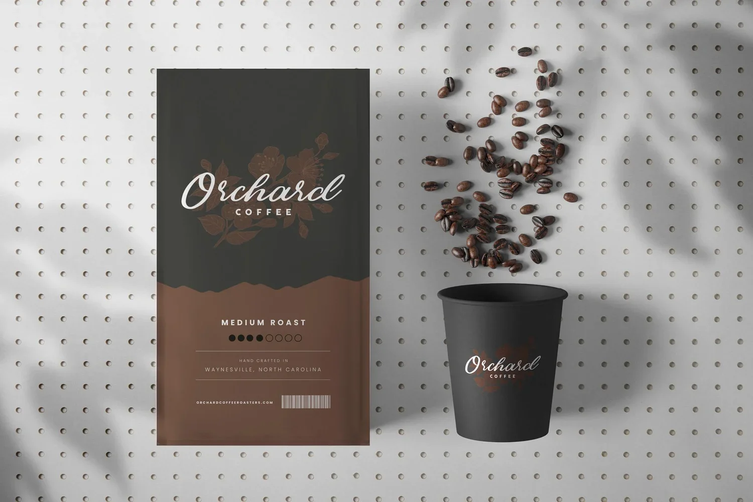
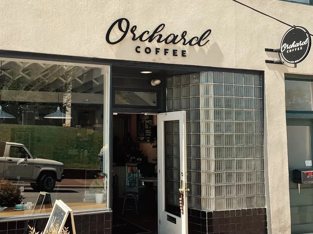
Orchard Coffee is a specialty coffee shop, nestled in the quaint downtown Wayneslville, NC. When I was asked by award winning barista Cabell Tice to come up with some concepts for the branding of his new venture, I couldn’t wait to get out the sketchpad. The name inspired me to dig a little deeper than the obvious apple imagery you might find with various related brands, eventually landing on the orchard blossom. This being Cabell’s first brick and mortar, and a grass roots, family run business, the idea made the most sense. Beginnings, newness, growth etc. Starting with a sketch of the apple blossom, I moved to finding the the right type treatment. This was my favorite of the first round of 3 concepts I presented, and thankfully, it was Cabell’s
first choice.
“When I was working on the brand for my cafe I reached out to Stephen to create a simple, elegant and elevated design. It’s not often design gets done right the first time , but I could just call Stephen “No Notes” because I had none after the first pass. Done right the first time!” - Cabell Tice, owner of Orchard Coffee
As the creative director, I overhauled Beck Digital’s brand/identity and website and designed the physical office space to reflect the company’s new direction. I also managed the creative team on client products, where we create websites, print materials, conference booth designs, signage, digital ads, and more. See more on Beck Digital →
“While under Stephen's creative direction, I always called him captain because that's honestly how I viewed him. I believed in his vision, his leadership and happily jumped on-board - no matter where the ship was heading. When I was asked to join his team, I let him know that I was a words of affirmation guy; he heard me when I said that and always took the time to encourage me, support me, and found the perfect ways to stretch me/grow me in a positive manner. The wisdom and experience he passed down to me was priceless. His passion is contagious and his creative brain cannot be turned off. Any company would be lucky to have this guy at the helm.” - Taylor McCleskey, Graphic Designer, Beck Digital
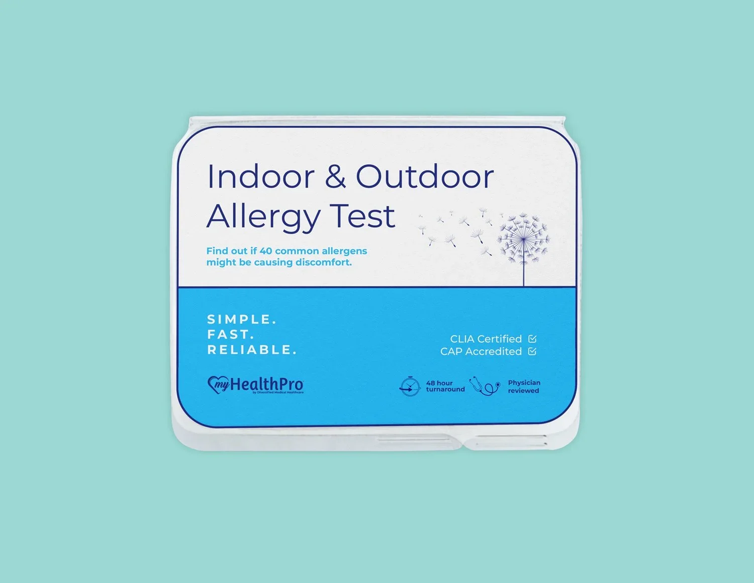
While working as Creative Director for Beck Digital, one of my favorite clients was My Health Pro. This seemingly very simple design for an at-home allergy test, was a blast to work on. This was the 4th concept presented and the least “designed,” but it just goes to prove Dieter Rams’s famous quote, “Good design is as little design as possible.” Packaging design, wether it be albums, food and beverage, or various merch items, has always been one of my most loved areas of design. I particularly have grown to appreciate the time and attention to detail required when working with printers and miscellaneous templates.
One of Beck’s biggest clients, the Queens Medical center in Honolulu, tasked us to build an interactive page for their Neuroscience department. This was a fun challenge and I’m very proud of the end result.
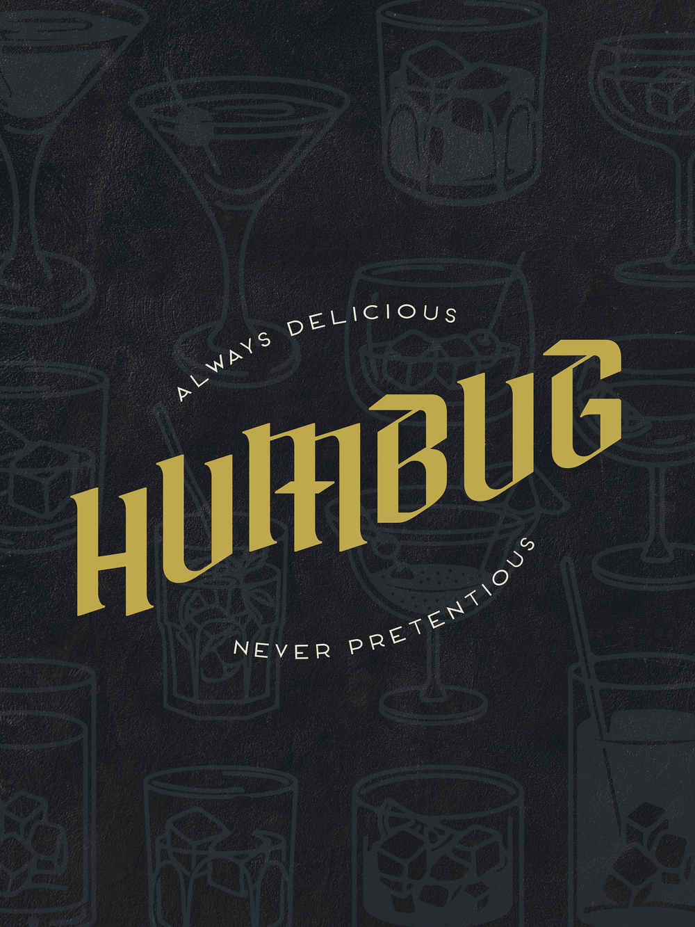
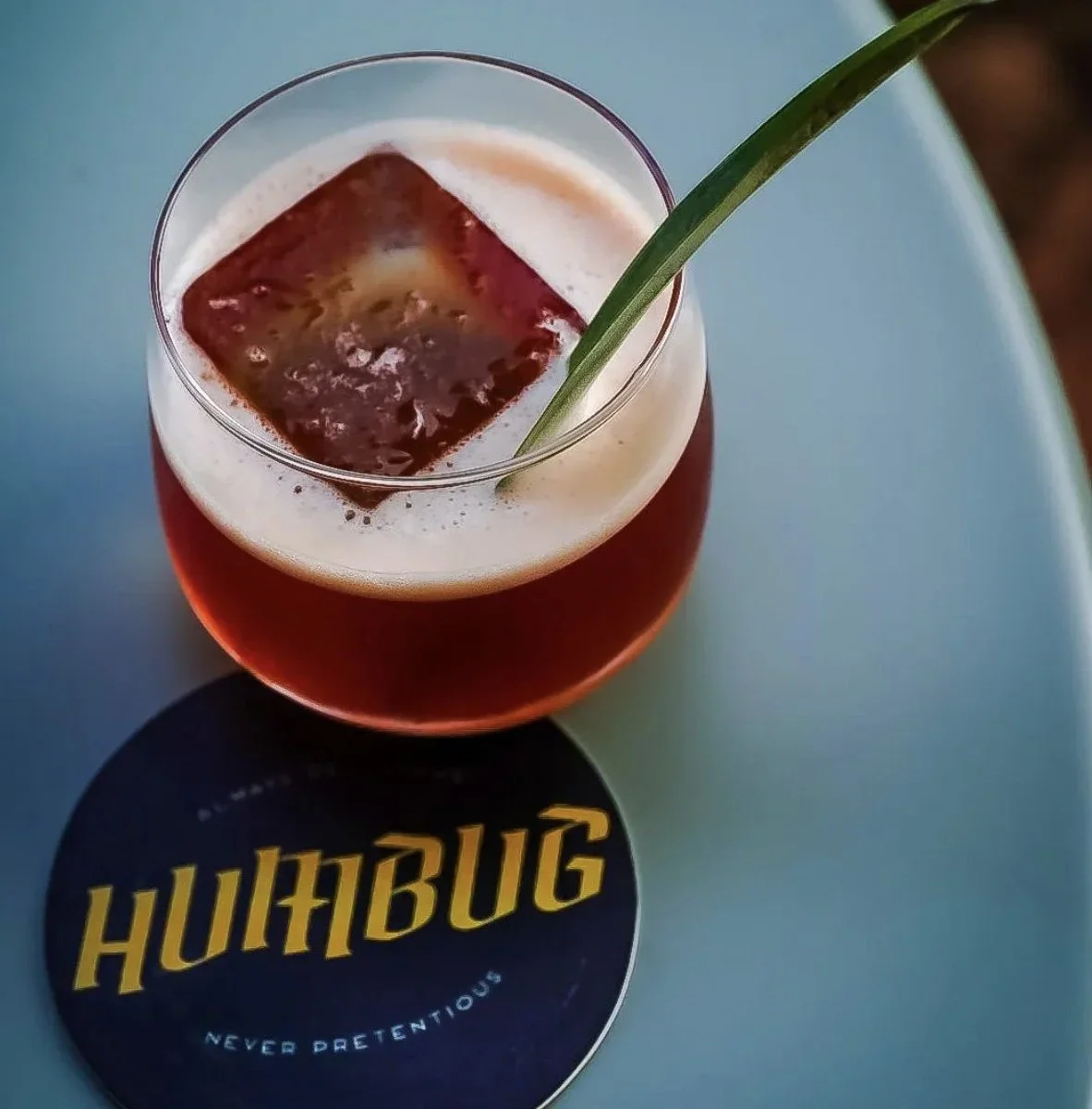
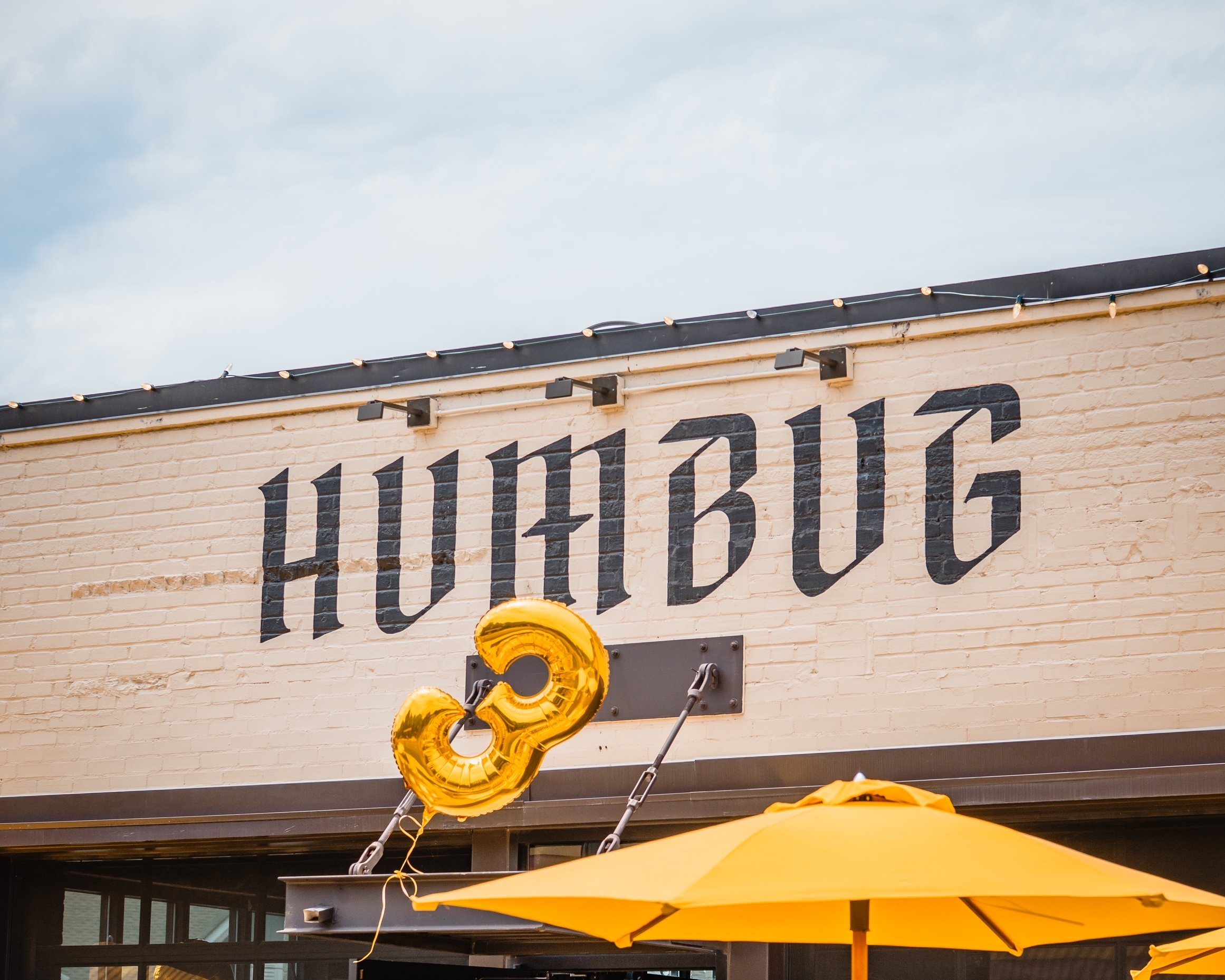
Humbug, the brainchild of Charlotte local mixology celebrity Andy Schools, is still one of my favorite projects to date. Andy called me one day and said, “I just got an opportunity move into a new space and I need a name and a logo for a new bar concept in 4 weeks.” When he told me his tagline “All deliciousness. No pretentiousness,” my first thought was to simplify it to what it reads now, “Always Delicious. Never Pretentious.” The idea was bar that serves upscale cocktails, without all of the frills that often make those places feel unapproachable. I don’t know why, but my first thought was to dig through titles of defunct comedy magazines from the past and one called “Humbug” stood out. I pitched the idea and Andy loved it. Sometimes the right thing just hits without any explaination, and that’s what happened here. The logo was the first thing I presented. I usually submit at least 3 options in the first round, but there was just soemthing about this one. Andy felt it too, and we were off to the races. Soon after, I was helping him get everything from coasters to exterior signage printed.
"Stephen is the reason we are successful today. He took a good idea and made it great and brought the branding behind it that we are known for. It was a total collaboration from the beginning and I couldn't be happier with the end result." - Andy Schools, Owner of Humbug
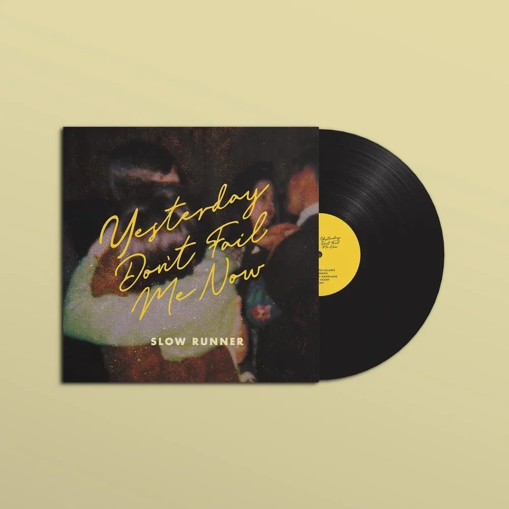
I’ve done numerous album designs for Michael Flynn/Slow Runner and other artists, of varying complexities, but this stands out as one of my favorite. Again, simple usually wins. It started with an old photo of his parents dancing and landed where it is now with the right crop, texture, type treatment, and nostalgic color palette.
“Stephen has done the cover art for the majority of my releases and every time I’m reminded how skilled he is at quickly distilling a project down to its emotional essence. A recent release called ‘Yesterday Don’t Fail Me Now’ is an album all about processing the death of my father so it required a particularly sensitive and soulful approach. I somehow made it through making the whole record without crying… until I saw the cover art. It was timeless and beautiful and bruised my heart in the best way.” Michael Flynn, Slow Runner
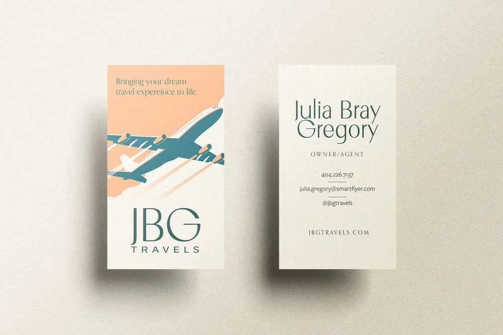
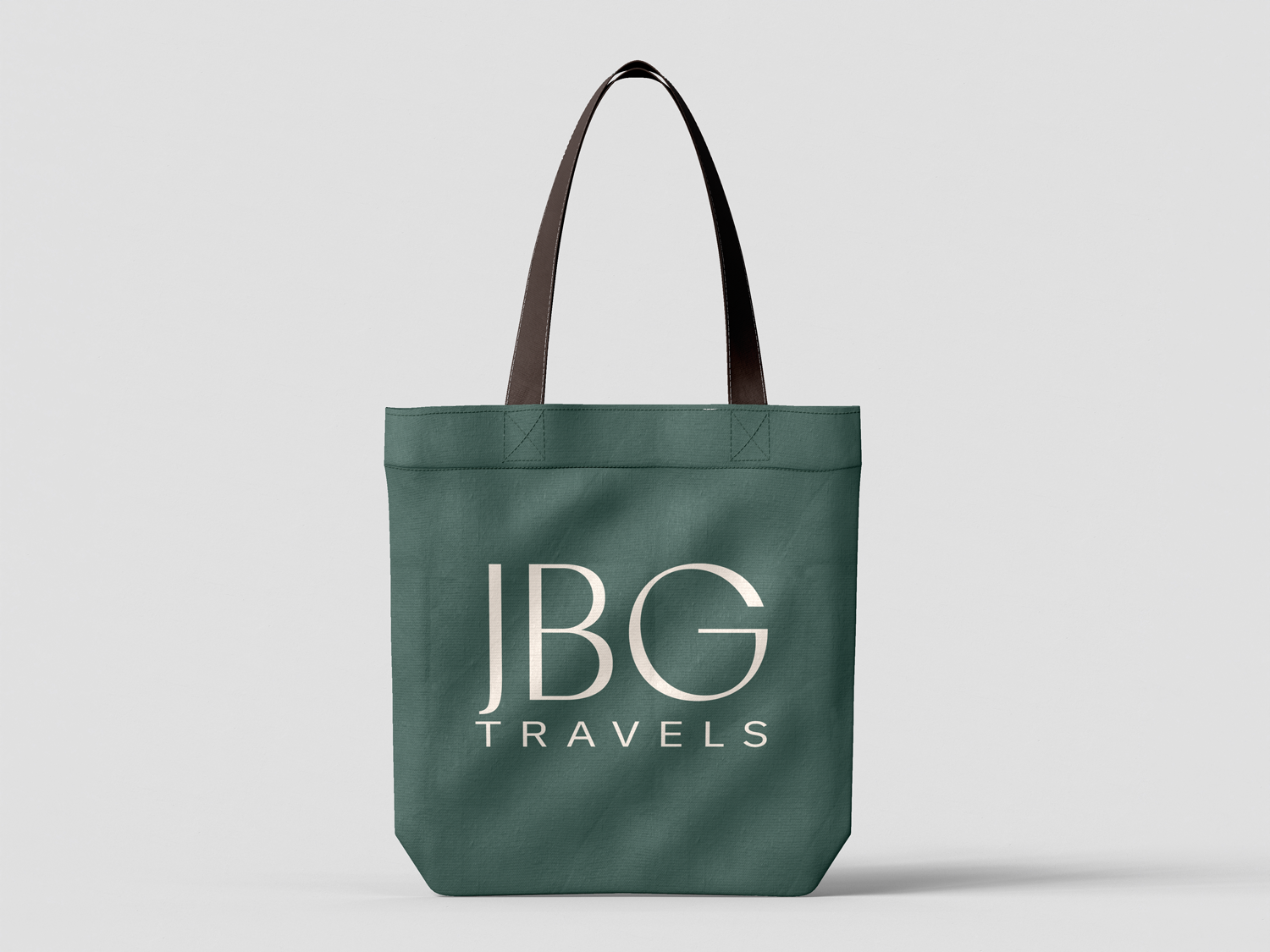
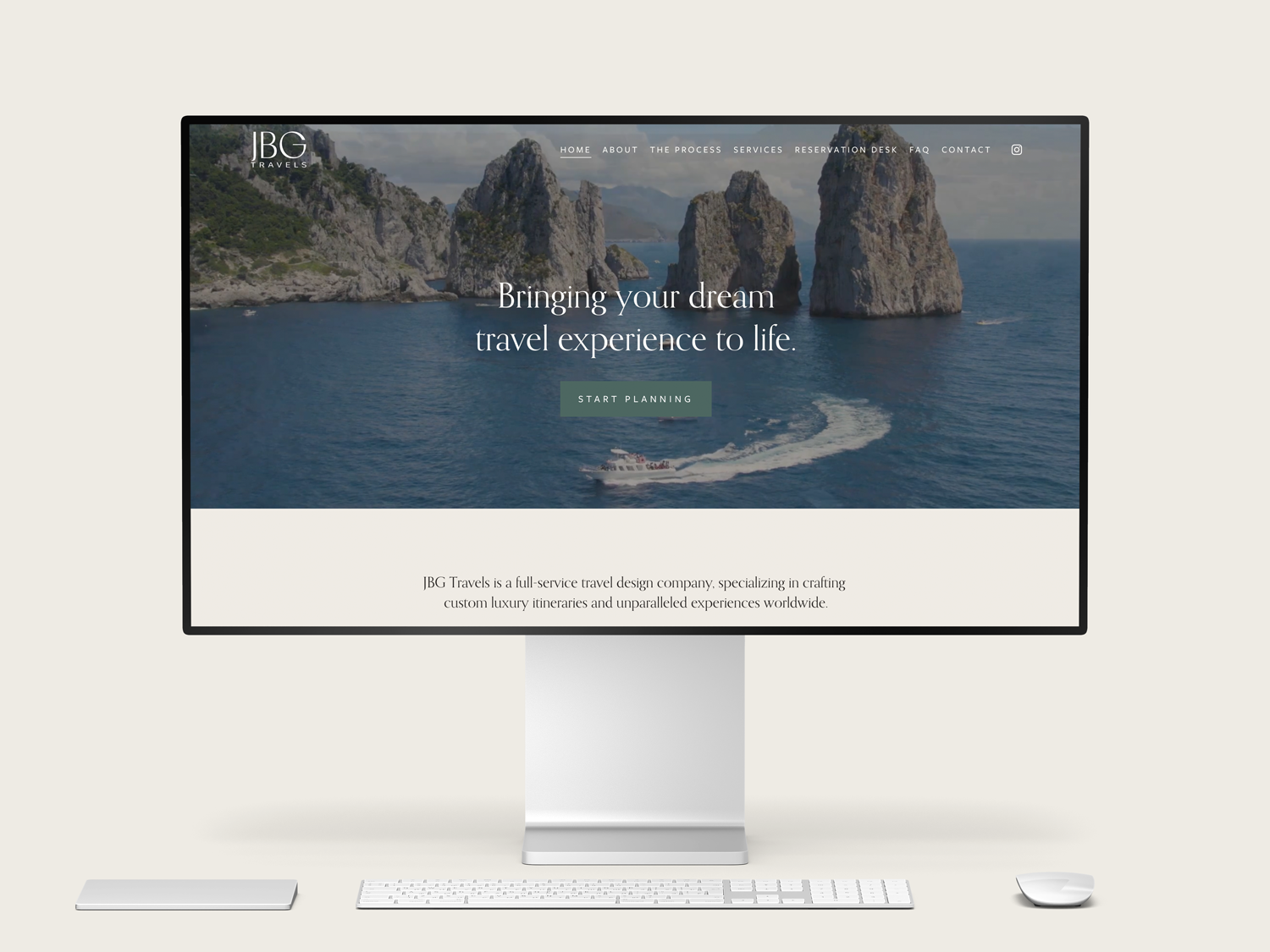
As someone who loves to travel, AND someone who loves to cosplay wealth, this was the perfect project for me. Ultimately, the branding for JBG needed to be effortless, timeless, and classic. This one only took a couple rounds to nail, and I’m so pleased with how it turned out, and I’m especially proud of the website.
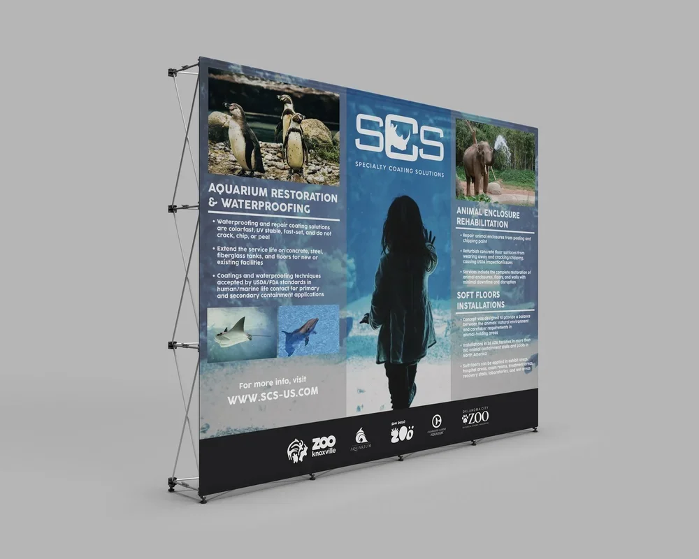
When Harry Heise, of SCS, a specialty coatings company I did the branding for about 10 years ago, came to me with a request for an aquaitic trade-show backdrop, I immediately knew what I wanted to do. The idea of a life size (or a bit larger) image of a child with their hand on the glass of an aquarium, overlayed with the bullet points provided by Harry, just came to me. Harry was very pleased, as was I, with the final product and it served as the perfect conversation starter that eventually led to a few large scale projects for SCS. I’ve done a few trade show setup designs and I love everything about the process, from sketching out the initial concepts to seeing it through to the final stages with the printers and manufactures.